E-mail: [email protected]
Phone: +86-572-8356001
E-mail: [email protected]
Phone: +86-572-8356001
Content
A pearl pigment that shimmers beautifully in a sample jar can go completely flat once it has been printed onto wallpaper base paper or troweled into a lime plaster. We have watched this happen in customer trials more often than anyone would like, and the cause is almost never a poor pigment. It is a mismatch between the powder and the way the finish is actually built.
Wallpaper and decorative wall finishes are unusual among pigment applications. The coating film is often thin, the substrate may be porous or dark, the binder may be strongly alkaline, and the finished surface will be judged from two metres away under warm interior lighting rather than under a laboratory lamp. Choosing well means holding all of those factors in view at once.
Before comparing colour cards, describe the system the pigment has to live in. In our experience four details decide most of the outcome:
Once those are pinned down, most of the pigment selection makes itself. The rest of this guide works through the variables in the order they usually bite.
Nearly all pearl pigments used in architectural finishes are built on a thin platelet substrate that is then encapsulated with metal oxide layers. The substrate sets the baseline brightness, the price point, and to a fair degree the chemical resistance.
| Substrate | Optical signature | Where it fits |
|---|---|---|
| Natural mica | Soft satin pearl, slightly creamy tone | Interior paper and non-woven wallcoverings, cost-sensitive ranges |
| Synthetic mica (fluorophlogopite) | Cleaner white, brighter sparkle, higher purity | Washable vinyl wallcoverings, premium print lines |
| Glass flake / calcium aluminium borosilicate | Sharp, high-contrast glitter with strong transparency | Accent designs, textured feature walls, decorative overlays |
| Titanium-dioxide-free grades | Gentle brightness without TiO2 | Ranges built around ingredient transparency and clean-label claims |
If a wallcovering has to survive wiping with a damp cloth, the substrate choice matters as much as the coating chemistry around it.
 Silver White Pearlescent Pigment, Anatase and Rutile GradesIndustrial silver-white pearlescent pigment available in anatase and rutile crystal forms and multiple particle-size grades, so finish and wallcovering requirements can be assessed together.View Product →
Particle size is the variable that most often surprises first-time specifiers. A grade that looks dazzling on a drawdown card can read as a flat wash once it is spread over ten square metres of wall.
| Band | Visual result | Watch out for |
|---|---|---|
| Fine, roughly 5-25 µm | Smooth satin sheen, almost no visible sparkle | Can look dull if the film build is very thin |
| Medium, roughly 10-60 µm | Balanced body with gentle travel of light | The safest general-purpose choice for most wallpaper |
| Coarse, roughly 30-100 µm and above | Distinct sparkle and pronounced texture | Settling in tanks, screen clogging, nozzle wear |
| Glitter grades | Confetti-like highlights, strong directional flash | Reserve for deliberate feature effects only |
At normal viewing distance a wall is judged as a whole surface, not as individual particles. Finer grades therefore carry a room better than most people expect, while very coarse grades can look noisy in a domestic setting and are usually confined to hospitality, retail and statement walls.
Most interior wall products are waterborne, and a growing share of decorative finishes are mineral-based. Lime paints, silicate systems and cementitious plasters can sit at pH 10 or above while they cure, and interference pigments in particular do not enjoy prolonged contact with strongly alkaline media. The practical mitigations are simple: add the pigment at let-down rather than into the grind, avoid extended high-shear exposure, and confirm compatibility with your specific binder with a small stability trial before committing to a production batch.
For facade renders, exterior wallcoverings and sun-facing atriums, lightfastness and chalk resistance stop being theoretical. Resin selection does much of the work, but the pigment grade has to hold up its end as well, which is why outdoor programmes deserve a grade that has actually been tested for weathering rather than one that is simply assumed to be suitable.
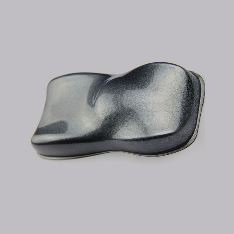 RAYSUM Weather-Resistant Pearlescent Pigment RangeWeather-resistant RAYSUM pigment grades in multiple colours and particle sizes, with non-chrome treatments and synthetic substrates for exterior wallcoverings, facade renders and sun-facing areas.View Product →
Gravure and flexographic wallpaper printing, roller and curtain coating, spray application and hand troweling each impose their own constraints. Printing rewards a narrow, consistent particle band and good dispersion stability in a low-viscosity ink. Roller coating is more forgiving on size but less forgiving on agglomerates. Troweled plasters tolerate coarse grades happily yet punish any undispersed lump with a visible streak that the eye finds instantly.
Whatever the method, handle pearl pigments gently. They are platelets, not spheres, and aggressive milling or over-dispersion breaks them, dulling the effect and dulling the colour along with it. A short low-shear incorporation at the end of the process is almost always better than a long grind early on. There is more on this in our notes on dispersion strategies for industrial pearlescents in waterborne and oilborne coatings.
Silver white remains the workhorse of the wallcoverings world because it delivers brightness and coverage at a sensible cost, and it flatters almost any base tone beneath it. Interference pigments shift hue with viewing angle, which is wonderful on a feature wall and distracting on a large flat plane; they read best over light or mid-tone grounds, because over a dark base the interference colour tends to sit as a film rather than as a glow. Golden and metallic lustre grades bring warmth to beige, taupe and terracotta palettes and pair naturally with matte binders.
Colour-shifting chameleon powders are best treated as accents, one wall or one border rather than a whole room. For textured finishes that genuinely need a glitter effect without PET content, dedicated non-PET ranges now make it possible to answer both the designer and the sustainability team with the same specification.
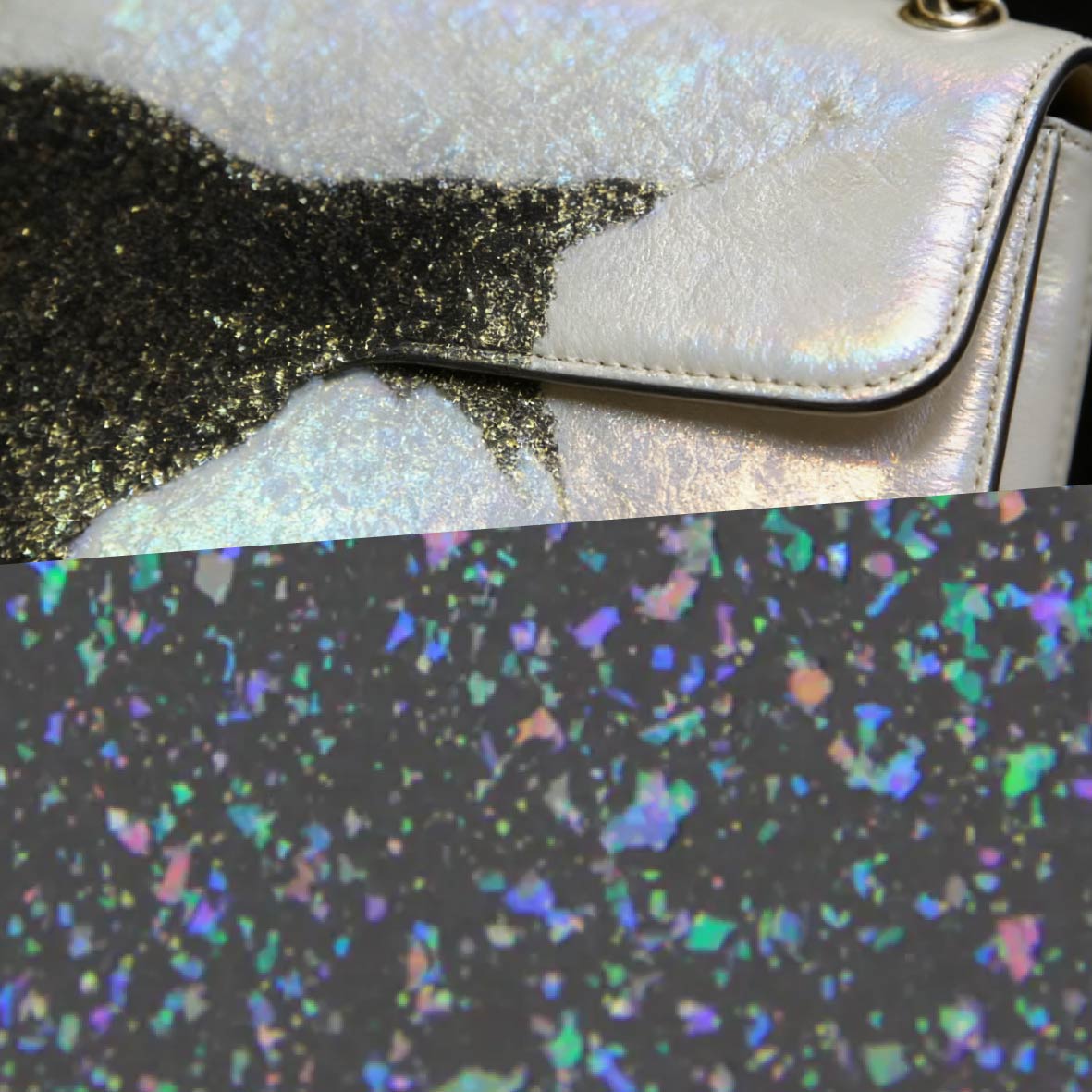 Non-PET Glitter Pearlescent Pigment for Sustainable FinishesNon-PET glitter pearlescent pigment using PE or PP substrates instead of PET, positioned for applications where biodegradability, recyclability and lower environmental impact guide material selection.View Product →
When we support a wallpaper or wall-finish project, we ask customers to work through roughly this sequence:
Projects that skip step three or step five are the ones that come back to us with questions.
When a decorative finish programme goes well, the pigment choice disappears into the background: the wall simply looks the way the designer sketched it. That quiet outcome comes from matching substrate, particle size, binder chemistry and application method in the right order, then verifying everything on the real surface.
We have spent years supplying pearlescent materials into both cosmetic and industrial lines, and the industrial side has its own dedicated resources, including an overview of industrial application fields that covers coatings, plastics, inks and decorative surfaces. If you are working on a wallpaper range or a decorative plaster system and would like a second opinion, our technical team is glad to look at your formulation and suggest a matched sample set.

Contact Us
Mobile

 English
 Español