E-mail: [email protected]
Phone: +86-572-8356001
E-mail: [email protected]
Phone: +86-572-8356001
Content
A pearlescent color card looks like a simple tool, which is exactly why it gets underestimated. Formulators, product managers, packaging designers and marketing teams all need one shared reference for what a pearl actually does on skin, inside a bottle and in front of a camera. Building that reference is less about artistry than about discipline: the same substrate, the same loading, the same lighting, and honest notes on how each pigment behaves as the viewing angle changes.
We make pearlescent pigments for cosmetic and personal care formulators, and we have watched plenty of brands rebuild a color card three times because the first version answered the wrong questions. This guide walks through the practical sequence: choosing pigment families, selecting substrates, standardizing the drawdown, reading swatches at multiple angles, and recording the data that keeps the card useful for years.
An absorption pigment tells roughly one story per lighting condition. A pearlescent pigment tells several, because its color comes from light reflecting off and refracting through thin, layered coatings on a platelet substrate. Change the base, the film thickness, the particle size or the angle of view, and the result changes with it.
Two consequences follow. A swatch only means something when its conditions are documented, and a card built on white alone will mislead anyone working with a dark shade or a transparent gel. Pairs of swatches over black and white show hiding power, depth and how strongly an interference color leans away from its base.
Particle size matters just as much. Larger platelets deliver a bolder, more sparkling effect; finer grades read as smooth satin with a softer glow. A card that records a color name without a grade sends a formulator hunting for a shade that does not exist in the size they need.
No card needs every pigment in a catalogue. Four groups usually cover a realistic development pipeline.
Silver-white pearls are organized by luster intensity. A natural series gives a soft, skin-friendly glow, a crystal series adds clarity and brightness, and a diamond series pushes toward a sharper, gem-like sparkle. One representative from each tier shows how much glow a given loading will buy.
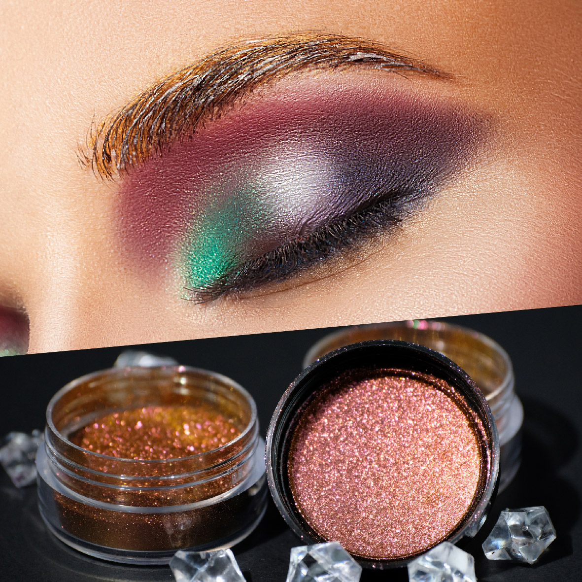 Cosmetic Grade Pearlescent Pigment Series for Product SelectionExplore cosmetic-grade mica pearlescent pigment series, including natural, crystal and diamond options, to compare luster and choose suitable effect pigments.View Product →
Within each tier, color moves along a familiar path: silver-white, interference, golden and metallic. Interference shades are the ones most often misjudged, because their hue is created by light rather than by absorption. They can look almost colorless on white and vividly colored on black.
If your line includes nail, eye or lip products that rely on movement, include a chameleon family. Classic, crystal, diamond, metallic crystal and nebula grades differ in saturation, brightness and how abruptly the color flips.
Hue-specific families deserve their own row. Nude skin tone pigments behave very differently from silver-white pearls on a complexion base, and shades such as saffron, magenta, antique, lava, platinum, summit gold, star diamond and scintillance are the ones most likely to carry a hero product.
Keep a small shelf chosen for performance rather than color: titanium-dioxide-free grades for clean-beauty briefs, silicone-coated and surface-treated grades for dispersion and skin feel, and magnetic pigments for texture effects. These are specified for regulatory or sensory reasons, so the notes should say so.
One substrate cannot answer every question, but six will cover most decisions.
| Substrate | Typical use | What it reveals |
|---|---|---|
| Black-and-white contrast card | First-pass screening of a full range | Hiding power, depth, and shift over dark ground |
| Clear film over black and white halves | Crystal, transparent and color-coated effects | Transparency, tinting strength and base influence |
| Black PVC or coated panel | Metallic, chameleon and high-sparkle grades | Angle shift without substrate interference |
| Standardized skin-tone base | Complexion, blush and highlighter shades | How a pearl flatters or greys out on skin |
| Cured film of your own formula | Final selection and sign-off | Compatibility with oils, silicones and film formers |
| Glossy nail tip or cured gel | Nail and lip concepts | Gloss build-up over a smooth, reflective layer |
Keep substrate batches identical across the whole card, and note the substrate on every swatch. A pearl that looks muted on a thick white base is often the same pigment that looks brilliant on black.
Standardizing these five steps is what turns a card from a display piece into a decision tool.
Pearl effects are usually described at roughly 15 degrees near gloss, 45 degrees at mid-angle and 110 degrees at flop. A swatch judged only straight on hides the travel that actually sells a product.
Chameleon grades deserve a dedicated row, viewed against a dark base under the same lamp each time, so you can record the two dominant hues and the transition between them.
Color Changing Pigment Powder and Chameleon Pigment SeriesCompare chameleon pigment options including Nebula, Diamond, Crystal and Classic for cosmetic-grade effect pigments under consistent lighting conditions.View Product →
Lighting does as much work as the pigment. Use a D65 viewing booth for the reference reading, then check the card once more under a warm retail lamp, because that is where customers will meet it. Keep the photo protocol constant too: same camera, distance, background and exposure for every swatch.
A card without data ages badly. Alongside each swatch, keep at least these fields.
| Field | Why it matters |
|---|---|
| Pigment code and INCI name | Keeps the card aligned with labelling and documentation |
| Substrate and base color | The same pearl reads differently over black, white and skin tones |
| Particle size range (d50) | Explains sparkle versus satin and guides grade substitution |
| Coating chemistry | Interference, gold and metallic effects come from different oxide layers |
| Loading percentage | Prevents over- or under-dosing when the formula moves to trial |
| Binder or medium | Shows how the pearl behaves in oils, silicones or water-based systems |
| Angle notes (face, mid, flop) | Documents the shift that customers actually see |
| Batch and date | Makes lot-to-lot variation visible before it reaches production |
A color card is a living document. Refresh the reference swatches whenever a new lot arrives, and archive the old ones. Lot-to-lot variation in particle size distribution is normal in pearlescent pigments, and a card that never changes will not warn you when a shade drifts.
Store swatches away from direct light, heat and humidity, and keep a digital twin with photographs and data that packaging and marketing can access. When the shade name on a box matches what a customer sees in daylight, the card has done its job.
If your brand is moving toward titanium-dioxide-free claims, keep those grades in their own set. Their brightness and coverage behave differently from standard titanium-dioxide-coated pearls, and mixing them on one card invites the wrong comparison.
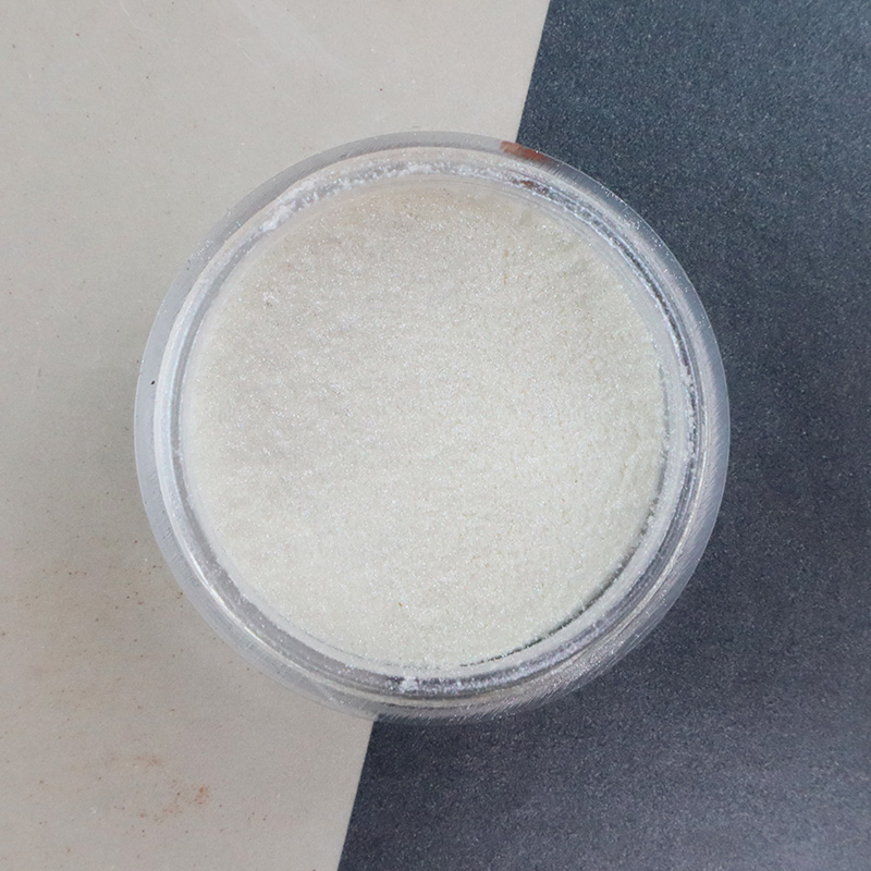 TiO2 Free Pearlescent Pigment for Cosmetic Color SetsReview TiO2-free pearlescent pigments such as Snow Velvet Silver-white when separating cosmetic color sets and requesting technical data.View Product →
A pigment supplier can shorten this work considerably. Ask for technical data sheets, batch certificates and dispersion guidance, review our pigments for cosmetic and personal care to plan your pigment set, and use the cosmetics pigment reference as a starting point for your own template.
Building a pearlescent color card is not a one-time project. It is a small piece of infrastructure that pays back every time a formulator, a designer and a buyer look at the same swatch and describe it the same way. Start narrow, document everything, and let the card grow with your range.
If you would like a second opinion on your pigment set, or a sample to test against your current reference, our team is happy to help.

Contact Us
Mobile

 English
 Español